To add a layer mask, highlight the layer you want to make the mask on, go to the bottom of the layers 'palette', find the grey square box with a white circle inside, click the button ONCE, and there ya' go!
What two colors are used to create the mask?
The two colors used are black and white!
Describe the process of using a layer mask?
Making sure the mask is highlighted (little box around it), the designer can then hide or show parts of the image on which the mask is over. Using the pen tool, with the black in the foreground, the designer can hide or "erase" parts of the image, while having white in the foreground shows the parts of the image that were previously hidden with black!
8 Principles of Design:
Repetition- this design shows repetition in the literal ocean waves, as well as the horse-sculpted waves. There are also curves in this design that illustrate this principle.

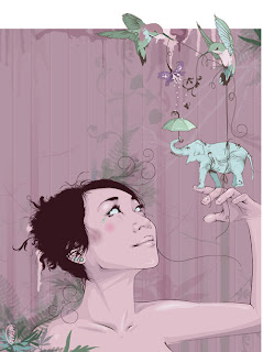
Proportion/Scale- ah. This lovely graphic image uses a more abstract proportion where the elephant is smaller than a hummingbird and the girl holding it. The hummingbirds are also rather large. Each object is proportional to itself, but with an interesting proportion with the rest of the design, it allows a lot of depth and interest.
Balance- this photo shows not only literal balance, but also the principle of (asymmetrical) balance with the stones further to the right of the image, allowing the eye to guide simply to the rock formation.

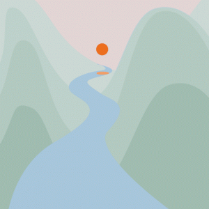
Emphasis- this lovely graphic shows emphasis on the orange sun in a very neutral green and blue scene. The river guides the eye to the orange circle, and the use of complementary colors between the blue river and the orange sun emphasizes it even more.
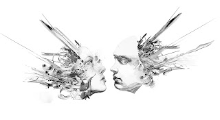
Unity- in this design, the chaos takes place at the sides of the image, while the unity occurs with the two faces almost touching, very close to each other. This center brings together the design to create a large, complex image.
Variety- there is much variety in this MGMT album cover art. The different textures in the background, wave, and water show variation. The cat, which is also the wave, varies with the shapes and style and colors, yet still remains unified but shows variation. The different shapes in the 'waves' (cat fur/ whiskers, I would assume) and the background are very different, as is the water (which has a completely different texture).

Rhythm- the use of line and placement of the shapes in this design help connect the center of the piece to the sides and vis versa.
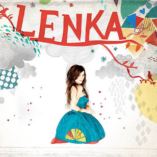
Contrast- Based on the definition I have of contrast (where two similar items are used differently/look different from one another), this fits the bill. With the drawn arches and lines, used in various ways, as well as with the triangles, contrast is seen. Plus, even Lenka shows classic contrast with dark hair and light skin and a bright dress!
Happy mid-/late November! :)
No comments:
Post a Comment