Monday, March 19, 2012

Assignment 16: Research and Inspiration!

History Timeline (Infographic):

Research on Information Graphics:
  • Visual representation of information, neat and organized, presenting complex information quickly and clearly
  • Visual shorthand
  • Charts, diagrams, graphs, tables, maps, lists, and timelines
  • Often used for maps, statistics, weather forecasts, etc.

Inspiration:
Color scheme- earthy tones, neutrals, skins, greens, browns, cremes
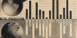
Visual ideas- sign language, loopy thread, a little grungy (or very, very clean), fake graph/table
Information- At least one of each podcast (~9 to 10)

Sign language hands: trace each letter needed and use opacity and brushes to color in

I find the dark contrasting with the light very appealing. Dark side could have date, light side the fact

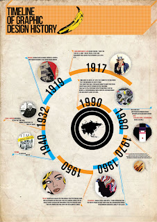
Good color scheme. the use of photos in little bubbles works well with the simplicity of the overall design, and the use of large and small text (year vs description)

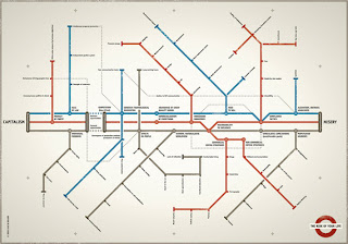
The use of a transit map is so extremely witty it's not even funny. I like how the center three line includes the descriptive facts, and the smaller routes branch off into some other text, related to the fact, most likely.


Wish me luck!

Monday, March 5, 2012

Assignment 15: Research and Inspiration!

Illuminated Manuscript!

Research-
Illumination- the paper background and border design, colors, theme
Initial Cap- huge first letter of the text, theme with design, same colors
Text- a song, poem, story, etc.

Used for religious text, very ornamental, hard to make

Inspiration-
-Water themed: fish, ocean waves, scales
-Color scheme: Monochromatic-- blue blue blue blue blue! And gold.
This has a really simple illumination that I like, and the initial cap has a beautiful color and water texture

I absolutely love this illumination. It has a gorgeous design and the leaf and vines work well with a simple smaller background. And I really like how each line of text is separated and has smaller initial caps and fonts/designs within. It is simple and neat, but still appealing and easy to read

I like the scales and different colors within, as well as the design being contained in a shape (the 'O'). The colors are also nice and simple...soothing, almost.

And last...
This layout is beautiful. I love how intricate it is, and how it does not surround the whole body of text, but instead has bracket-type look to it. And the added illustration on the right is nice, and keeps things simple. I also like how the initial caps really blend in with the illumination.


Wish me luck...!