Friday, October 21, 2011

Color Schemes!

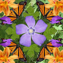
The complementary color scheme is used above in this picture of the butterflies and the flowers

An analogous color scheme is seen above using reds, red-oranges, and oranges

This piece of blue wonderful-ness uses a monochromatic color scheme!

Split-complementary was used in this photograph, in a way: Orange and blue-violet/blue-green, or the other way around: Blue and yellow-orange/red-orange


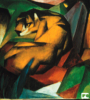
Split-complementary: This piece uses yellows, reds, and blues to create a slightly geometric look, as they do not simply "blend together".

Andy Warhol!

Within what art genre did Warhol work?
Pop art!

Define the genre?
An art movement that emerged in Britain in the 1950s, generally using mass-produced visual commodities by removing the object from context for contemplation

During what years was he alive?
August 6, 1928- February 22, 1987

Post 2 samples of his art. Answer the following questions for each piece.

Title of the piece?
Campbell's Tomato Soup can by Andy Warhol

Describe the color that he utilizes. Does he use any particular color scheme?
Red; and he just used red and white in this one

What do you notice about the artwork itself?
It looks like the label of the soup can, 2-dimensional; it seems realistic and very detailed; color-blocking is used


Title of the piece?
Marilyn Monroe

Describe the color that he utilizes. Does he use any particular color scheme?
Blue, yellow, and pink (red); this is a triadic color scheme

What do you notice about the artwork itself?
For the most part, it's rather color-blocked, and very realistic with the black shadows

Friday, October 14, 2011

Review Week 9!

Compare and contrast vector graphics and pixel images.
Vector-based graphics are defined by mathematical equations and are scalable to any size, meaning that they can be stretched or shrunken and still maintain all quality. They are constructed by lines, shapes, and curves (include icons, illustrations, t-shirt art, etc.). Pixel-based images, on the other hand, are constructed of pixels, and produce continuous tone images (unlimited ranch of colors and shades of grey). They are resolution dependent.

What resolution is necessary to print raster images?
To render a raster image accurately, a high end printer needs a resolution of 300 dpi (dots/inch)

What resolution is necessary to display raster images on the internet?
On-screen, raster images typically need a maximum of 72 dpi (a lot smaller, eh?)

Happy Friday! :) Half-way through October already?!

Friday, October 7, 2011

Steve Jobs

Who is Steve Jobs?
An American computer entrepreneur and innovator and co-founder of Apple Inc. He was also a prominent past figure in Pixar Animation Studios and Walt Disney Studios.

What company was he CEO for many years?
Apple!

What did he do for the computer industry?
Jobs came up with, and helped engineer/build, the Macintosh computer, a successfully small computer with graphical user interface. He also founded NeXT Computer, which was very technologically advanced, and later included a vast multimedia email system.

How did this man impact the graphic design industry?
Steve Jobs was very into making his designs aesthetically pleasing, and he created innovative computers that allowed for the progress of the graphic design industry.

:)

Review Week 8!

Why must designers pay close attention to how color is utilized within a composition?
Color choice makes or breaks a design; when used correctly, color can convey the message that the designer is trying to, and can also evoke an emotional reaction.

Why is the color wheel an important tool for graphic designers?
This visual tool shows the relationship between primary, secondary, and tertiary colors, as well as their complementary and analogous colors.


Find an example of neutral colors utilized within a design (hint: google poster design). Near the sample, discuss why you feel the designer included neutral colors within the composition.

The neutral colors in this Kings of Leon poster gives it a very aged, vintage feel, much like their music (at least in my opinion). It's soothing to the eye in a similar fashion to how their music is soothing to the ear! :)

Briefly describe how we "see" the color of an object?
When light hits an object, all of the colors are not absorbed in the object and are instead reflected off of the object are the colors of the object. And that, my dear viewer, is how one "sees" the color of an object.

Farewell for now!