Saturday, December 10, 2011

Semester Reflection!

Well, is it really already (almost) the end of the semester? Time flies, doesn't it? No bother in being upset about it, though. Let us now reflect on my half-completed journey through Intro to Graphics and Design!

The class began with clueless, but excited, teenagers ready to gain some knowledge (like in Mr. Ray's class)!
-We began with Illustrator CS5 and played around with lots of fun vector graphic variations. Assignment one (vector graphic icons) was all about simplifying something, such as photography, a salon, and a bakery, as I designed. This was to be completed using the shape tool, might I add! No pen tool just yet.
-That came in during assignment two (texture grids), where we had just used the elements of design and were using them in a project! This is where we learned all about utilizing the pen tool. We also learned about the ever-important clipping mask! My completed 3x3 grid was Design of the Week, might I add. (Though one of my squares is lacking a background on my blog, oops...)
-Next, we learned ALL about color! We did some fun assignments, too! There was a small classwork assignment where we cut out photos with each of the color schemes (complementary, analogous, split-complementary, triadic, and monochromatic) and explain why we believed this way. The next assignment, assignment three, was to use the pen tool to create silhouettes of some objects to create an inner and outer circled color wheel! We used to CYK (cyan yellow magenta) sliders to manipulate the specific colors we needed for the fill of each silhouette and filled each with a color to match the inside one! There were many layers!
Then we had some fun...
With Adobe Photoshop CS5 (extended)!!!
-For assignment four, we continued with the same unit with color, but studied the work of the iconic Andy Warhol! Most famous for pop art, this fourth assignment was based on him. We used pictures that were darkened/saturated and painted in the color behind the black shadows of the photo~
-We then began studying image resolution, dpi, resizing images, and all that jazz, and created photo mosaics for assignment five! I absolutely love how everyone's turned out wonderfully, and it was nice. But super labor intensive! And we only got--what--two days? That really put the pressure on, and I barely finished mine on time! Plus, it took forever to save because of all the layers and images! :o (I was pushing it, anyways, finishing two minutes before the bell rang!)
Around here is where we studied the principles of design! There are some previous posts from November about the principles, as well as a new feature called layer masks!
-Stephen Kroninger, that lovely artist, was the next subject of study! He creates fantastic pieces using magazine cutouts and collages them to create another image (there is a post about that here)! He also has his own book titled "If I Crossed the Road...". Our next assignment, assignment six, was to create a picture of where we would go if we could cross the road! We learned about making a layer mask and using either the brush tool (black in foreground to hide; white in foreground to show) or the magic wand tool! It was very detailed, but a fun assignment that allowed creativity to explode! I mean, I went to Narnia where Justin Beaver resides, along with a banana-horned Mr. Tumnus wearing an Aslan t-shirt. Humor is tolerated, luckily! :-)
-Assignment seven used a layer mask, too! In this assignment we extended our layer mask and color editing knowledge to photoshop ourselves into a photo of our favorite celebrity! Now, that also meant we had to take a picture that resembled the already-there people, and make a layer mask to hide our own background. I photoshopped myself into a photo of John Lennon and Yoko Ono, which was interesting. I felt like I was intruding on a very couple-y photo. I think I pulled it off, though. Maybe.
Next we learned about type using a Prezi presentation! Wheee! We learned all about the different kinds of type and the parts of type (like serif, ascender, descender, etc.). By typing up a word and changing it to outlines, we learned to create typography; the art of using words to make a picture.
- Assignment eight was all about that! In manipulating the letters and shape and size of a single word, we used a guide image to create a product with shadow and everything using LETTERS! Wow! It's very time-consuming, depending on the type of image, but it's rewarding and exciting!

Things that would be helpful change: Possibly a bit more time for some of our assignments! Maybe I'm just slow--wait, no. I already know that I'm slow-- but it's hard to keep up sometimes (with assignments, not blogs)! Plus, I can't download illustrator anymore for free, and I can only download photoshop for a 30-day trial, so things are getting tricky!

What I hope to learn next semester: I feel as though I have learned so much already! I am honestly not quite sure right now! Of course, I will be super excited for whatever comes next!


*All my assignments can be viewed on my Assignments page !

Happy holidays 2011, everyone! :-)

Review Week 17!

Who shot the serif?! [www.ilovetypography.com]
And what I learned... :-)

The serif may have originated in ancient Rome, where inscriptors would carve out whatever the writer wrote on the slab, including the brush strokes at the end of the letters. Though, they are not quite sure where the terminology 'serif' itself originated, the Chinese and Japanese translated definitions are related to legs or fish scales, respectively.
The two main types of serif are Adnate and Abrupt. Adnate serif have a more organic transition from the stem to the serif, usually with a curve. The Abrupt serif, as its name suggests, has a more defined transition; blocky and sharp.


Only a week and a half left before winter break! Two weeks before Christmas! Wow!

Saturday, December 3, 2011

Review Week 16!

How many points are in an inch? How many points are in a pica?
There are 72 points/inch; 12 points/pica!

Of the seven classifications, which classification(s) would best work as body type? Why?
Sans Serif- this type has no serifs, which makes reading passages easier, and has uniform weight in its strokes

Identify the lowercase characters that have ascenders?
(extending above the waist line) b, d, f, h, i, j, k, l, and t

Identify the lowercase characters that have descenders?
(extending below the base line) g, j, p, q, and y

Classify the following typefaces and briefly explain why you believe it should be classified that way:
02.png
^ This typeface could be classified as Slab Serif or Egyptian because it has a uniform weight through the stroke and thick, square-shaped serifs.
01.png
This typeface could be classified as Script because of it's varying of thick and thin strokes, reminiscent of handwriting, and would work well as a heading, but not as body text.
05.png
This typeface could be classified as Decorative or Ornamental, as it has a distinctive design and would not be able to be classified as anything else. It would also work well as a header, not body text.
04.png
This typeface could be classified as Sans Serif, as it lacks serifs completely and has a very uniform weight in its strokes. It would work well as body text, as it is plain and easy to read.
07.png
This typeface could be classified as Blackletter because of it's very fancy, calligraphy-like strokes of various sizes, but it could also be classified as Decorative because of it's unique serifs.
06.png
This typeface could be classified as Old Style or Roman because it lacks a large contrast between thick and thin of its strokes and has wedge-shaped, angular serifs.
03.png
This typeface could be classified as Modern because of its sharp contrast between the thick and thin of the stroke and its thin, flatter serifs.


Happy December! :) Three more weeks?!

Tuesday, November 29, 2011

Podcast #4: Typography!

Define typography?
The art of expressing ideas through the selection of appropriate typefaces!

Where did the word "typography" originate from?
Greek- typos- (form) & -graphy (writing)

What does typography involve?
Illustrative techniques; spacing, line thickness, line space, etc.

What is a typeface?
Distinctive designs of visual symbols that are used to compose a printed image/design

What is another term for typeface?
FONTS!

What is a character?
Individual symbols that make up a typeface; letters, numerals, and punctuation marks

What is type style?
Modifications in a typeface that create design variety while maintaining the visual style of the typeface; bold, italic, condensed, roman, heavy

What does type style "create" within a design?
Creates consistency and variety of interest

What is the waist line and what does it indicate?
Imaginary line drawn at the middle of the characters

What is a base line and what does it indicate?
Imaginary line drawn at the bottom of the characters

What is an ascender?
The part of the character that extends above the waist line

What is a
descender?
The part of the character that extends below the base line

Describe a serif?
Smaller line used to finish off a main stroke of a letter, usually at the top and bottom of a character

How can the size of the typeface be identified?
Point size- the vertical measurement used to identify the size of a typeface; top of the ascender to the bottom of the descender

What is a point?
Unit that measures point size

How many points are in an inch?
72 points

What
is a pica and how many are in an inch?
6 picas/inch

How many points are in a pica?
12 points

What is body type and where can it be found?
Type sizes that range from 4 point through 12 point type; found in places where there is a lot of text to be read

What is the key to selecting appropriate typefaces to be used as body type?
Readability!

What is display type and how is it used?
Type sizes above 12 points. Typically used to draw attention to a message (headlines, subheadlines, etc.)

What is reverse type and when would it be used?
Consists of white type on a solid black or darker color background; if text too small, reverse type can be difficult on the reader's eye; necessary

What is a typeface classification?
A basic system for categorizing typefaces

When was Blackletter invented and how was it used?
Earliest of the typefaces, used in the mid-1400s with the invention of the printing press

Describer the characteristics of a Blackletter typeface?
Resemble the calligraphy of the time and are highly ornamental and elaborate thick to thin strokes

When was Old Style invented and what was is based on?
15th-16th century by Renaissance; based on ancient Roman inscriptions and was created to replace Blackletter typefaces

Describe the characteristics of an Old Style typeface?
Wedge-shaped, angled serifs and a low contrast of their thick/thin strokes

When were formal scripts developed?
Developed from formal writings of the 17th and 18th centuries' handwriting masters; lend a formal quality to a composition

When were casual scripts developed?
Developed in the 20th century!

Describe the characteristics of a Script typeface?
Based on forms made with flexible brushes or pens and have varied strokes reminiscent of handwriting; should not be used as small body text

When was Modern typefaces developed and why?
Developed in the late 18th and 19th centuries as a radical break from the traditional typography of the time

Describe the characteristics of a Modern typeface?
Sharp contrast between thick and thin strokes and have thin, flat serifs

How early can Sans Serif typefaces be found? What happened?
Found as early as the 5th century, however, the Italian Renaissance return to Old Style made the Sans Serif classification obsolete in the 20th century

When did they become popular?
The 1920s!

What does "sans serif" mean?
"Without serifs"

Describe the characteristics of a Sans Serif typeface?
The strokes are uniform in weight and have a monotone appearance

When was Slab Serif developed and why?
The 19th century for advertising

Describe the characteristics of a Slab Serif typeface?
Uniform line weight and thicker, square serifs

Describe Decorative typefaces?
Have the most distinctive design style; includes a variety of typefaces and are typically those that don't belong to other classifications; may incorporate pictures of objects, animals

Why were they developed?
Developed with a specific purpose, or theme, in mind

What are they best used for?
Best used for larger point sizes, or display type


Happy almost-December! :-)

Saturday, November 26, 2011

Review Week 14!

Identify 5 colleges that offer graphic design (or related) majors. For each, list the school name, location, graphics majors that are offered, requirements for admission.

1. Savannah College of Art and Design (SCAD)- Atlanta, GA, Savannah, GA, Hong Kong, and Lacoste! Offers BA, BFA, MA, and MFA degrees. Admission requirements (for first-year freshmen): one (1) completed application, as well as an application fee, diploma from US high school or equivalent, SAT or ACT scores if US citizen, proficiency in English language, other documents or materials required to obtain a student visa, and supplementary materials!
2. College for Creative Studies- Detroit, Michigan! Offers a BFA in graphic design! Admission requirements (for undergraduates): Commitment, maturity, and readiness, completed application with $35 app. fee or free online application, official high school transcript with minimum 2.5 GPA (applicants who earned a GED must submit scores with at least a 401), SAT or ACT scores (not required if GED submitted), and a 5-8 piece portfolio!
3. Maryland Institute College of Art (MICA)- Baltimore, Maryland! Offers a Post-Baccalaureate Certificate (GD PBac) and a Master of Fine arts (MFA)! Admission requirements for freshman (regular admission): application (& fee), high school diploma or equivalent, letters of recommendation, SAT and/or ACT scores, essay, list of activities and interests, 12-20 piece portfolio, and students are encouraged to visit the campus!
4. Rhode Island School of Design- Rhode Island! Offers a BFA and an MFA for graphic design! Admission requirements: application, transcripts, two drawing samples, 12-20 piece portfolio, writing samples, letters of recommendation, and SAT scores!
5. Academy of Art University- San Francisco, California! Offers a BFA and MFA! Admission requirements: application (& fee), official transcripts, and a portfolio!

What is a portfolio?
A portfolio is a collection of original works normally put together for interviews for college acceptance or a job. Sometimes the portfolio is assembled digitally as well as in print in a folder, while others contain large pieces that may or may not fit in a large portfolio bag (similar to a giant envelope)!

What is the importance of a portfolio?
Portfolios are extremely important to colleges and employers. A portfolio allows the college admission team or the employer to view an interviewee's original work and distinguish the good workers from the not-so-good. A large collection full of well done work is impressive and will get the art college-hopeful or employee-hopeful person a good impression. :-)

Friday, November 18, 2011

Review Week 13!

How do you add a layer mask to a particular layer?
To add a layer mask, highlight the layer you want to make the mask on, go to the bottom of the layers 'palette', find the grey square box with a white circle inside, click the button ONCE, and there ya' go!

What two colors are used to create the mask?
The two colors used are black and white!

Describe the process
of using a layer mask?
Making sure the mask is highlighted (little box around it), the designer can then hide or show parts of the image on which the mask is over. Using the pen tool, with the black in the foreground, the designer can hide or "erase" parts of the image, while having white in the foreground shows the parts of the image that were previously hidden with black!

8 Principles of Design:

Repetition- this design shows repetition in the literal ocean waves, as well as the horse-sculpted waves. There are also curves in this design that illustrate this principle.

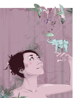
Proportion/Scale- ah. This lovely graphic image uses a more abstract proportion where the elephant is smaller than a hummingbird and the girl holding it. The hummingbirds are also rather large. Each object is proportional to itself, but with an interesting proportion with the rest of the design, it allows a lot of depth and interest.

Balance- this photo shows not only literal balance, but also the principle of (asymmetrical) balance with the stones further to the right of the image, allowing the eye to guide simply to the rock formation.

Emphasis- this lovely graphic shows emphasis on the orange sun in a very neutral green and blue scene. The river guides the eye to the orange circle, and the use of complementary colors between the blue river and the orange sun emphasizes it even more.

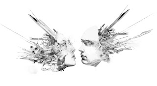
Unity- in this design, the chaos takes place at the sides of the image, while the unity occurs with the two faces almost touching, very close to each other. This center brings together the design to create a large, complex image.

Variety- there is much variety in this MGMT album cover art. The different textures in the background, wave, and water show variation. The cat, which is also the wave, varies with the shapes and style and colors, yet still remains unified but shows variation. The different shapes in the 'waves' (cat fur/ whiskers, I would assume) and the background are very different, as is the water (which has a completely different texture).

Rhythm- the use of line and placement of the shapes in this design help connect the center of the piece to the sides and vis versa.

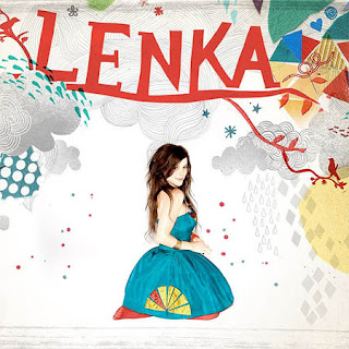
Contrast- Based on the definition I have of contrast (where two similar items are used differently/look different from one another), this fits the bill. With the drawn arches and lines, used in various ways, as well as with the triangles, contrast is seen. Plus, even Lenka shows classic contrast with dark hair and light skin and a bright dress!

Happy mid-/late November! :)

Friday, November 11, 2011

Stephen Kroninger!

What kind of art/design does he produce?
Stephen Kroninger uses various magazine/photo cutouts to collage together an image!

In what publications/media studios has his work been featured?
Time magazine (on the cover!), the Museum of Modern Art, where he had a solo exhibit, and is a regular contributor to Time, Newsweek, The New Yorker, and the New York Times!

Post 2 samples of his art. Answer the following questions for each piece...
Was this piece published? Where?
Yes, in the book Tie Your Socks and Clap Your Feet: Mixed-up Poems By Lenny Hort, illustrated by Stephen Kroninger

What principles of design were utilized within the piece? How?
Emphasis is incorporated into this design, especially with the man's head, which is made of a piece of toast, while variety in patterns is used (for every material), asymmetrical balance of the large man that takes up a whole page and the smaller table, and proportion (rather odd proportion) shown where the chair is very small, as well as the table, but the food is big and the man is big as well.

What elements of design were utilized?
Texture, shape, line (of the arm and table), and color

Was this piece published? Where?
On Time Magazine's website, yes, it was.

What principles of design were utilized within the piece? How?
Repetition of the books, proportion (with the large eyes and mouth on a big head, next to small books), balance of the face and the chef's hat, emphasis on the fire-y eyes, unity is seen with the use of kitchen supplies and the food, though variation is also used with the books

What elements of design were utilized?
Line, shape, some space (with the hat, kind of), a tad bit of texture on the hat, and color!

Review Week 12!

How can you, as the designer, use principles of design to help compose a page?
The correct use of repetition (not too overbearing, though!), proportion, balance, and emphasis while still creating a unified piece will help form a composition of winners.

What are the principles of design (define each in your own words)?
-Repetition: the use of a similar image/form that repeats itself;this can be aided by bold lines/fonts, color, a particular format, spacial relationships, and design elements
-Proportion/Scale: the size of elements in a design in relation to other forms used; the human body is the most universal standard way to measure proportion
-Balance: the way that heavy and light elements are arranged on the page while still keeping it neat;
  • Symmetrical balance: evenly distributed elements
  • Asymmetrical balance: larger elements offset the smaller ones
-Emphasis: focus is put on a specific area of a piece rather than the whole thing
-Unity: how the design is pulled together to form one large piece that flows
-Variety: the diversity of a piece
-Rhythm: continuity or organized movement in space and time, allowing the viewer's eye to float through the piece
-Contrast: where two similar items are used differently/look different from one another; the greater the difference, the greater the contrast


Can you believe that we only have six more weeks left of school until winter break?! Wowzers.

Wednesday, November 2, 2011

Podcast #3: Principles of Design!

Define principles of design?
Concepts used to arrange the structural elements of a composition

What do the principles of design affect?
How the principles are applied affects the expressive content, or the message, of the work

What is the principle of repetition?
The repeating of some aspect or element of the design throughout the entire document

Describe ways that the principle of repetition helps the composition/audience?
Repetition acts as a visual key that ties the piece together; it controls the reader's eye and helps keep their attention on the piece; repeating design elements helps the viewer navigate through the piece and helps unify and strengthen; makes a composition seem active

What are ways that you can incorporate repetition into your designs?
By repeating elements, using bold font, thick line, certain bullet, color, design element, particular format, spacial relationships, or anything else the reader might recognize

What should you avoid when working with repetition?
It is important not to repeat so much that it becomes annoying or overwhelming

What is the principle of proportion/scale?
The relative size and scale of the various elements in a design

What is the most universal standard of measure when judging size?
The human body!

How can the principle of proportion/scale be used as an attention getter?
When an unusual or unexpected scale is used

What is the principle of balance?
The distribution of heavy and light elements on the page

Which kinds of elements/shapes visually weigh heavier/greater?
Larger elements look heavier when next to smaller objects

What is another name for symmetrical balance?
Formal balance

Define symmetrical balance?
Occurs when the weight of a composition is evenly distributed around a central vertical or horizontal axis (identical elements reflecting across the axis; creates a secure, safe feeling and a sense of solidity

What is another name for asymmetrical balance?
Informal balance

Define asymmetrical balance?
Occurs when the weight of a composition is not evenly distributed around the axis; one dominant form that is offset by many smaller ones; tend to have a greater sense of tension

What is the principle of emphasis?
The stressing of a particular area of focus rather than the maze of detail of equal importance

What happens to a design that has no focus?
Nothing stands out; the effective use of emphasis calls attention to important areas

What is a focal point and how is it created?
A center of interest; the area where the eye tends to go first

How many components of a composition can be a focal point?
The largest, brightest, darkest, or most complex element in a design

What ways can emphasis be created in a design?
Creating a focal point; contrasting the primary element with a subordinate one; with a sudden change in direction, size, shape, texture, color, tone, or line

What is the principle of unity?
the "wholeness" of a composition

What three ways can unity be obtained?
1. Put objects close to one another in the composition, forcing the viewer's eye to move from one to next inevitably taking in the entire composition
2. Make things similar using similar textures, colors, or shapes that tend to visually connect the parts of a composition
3. Direct vision by a line that travels around the design; this line can be a true line or it can be suggested

What is the principle of variety?
Pertains to the differences and diversity; it makes a work of art interesting

What ways can a designer add variety to a design?
By varying textures, color, and shapes, and alter contrast, tone, and intensity

Why is it important to find the right balance between unity and variety?
Too much unity will look boring, while too much variety will look chaotic

What is figure?
A form, silhouette, or shape is naturally percieved as figure; the part of a composition we pay attention to

What is another name for figure?
Positive space!!!

What is ground?
The surrounding area around a figure

What is another name for ground?
Negative space!!!

When a composition is abstract (has no recognizable subject) what will the figure depend on? What does that mean?
It will depend on the abstract relationship between visual elements

Why must a designer consider the composition as a whole?
If not given careful consideration, the picture will only be partially designed

What is the principle of rhythm?
Continuity, recurrence, or organized movement in space and time

How is rhythm achieved?
Through the orderly repetition of any element, line, shape, value (tone), and texture

What three ways can rhythm occur in a design?
1. Intervals between the elements, and often the elements themselves, are similar in size or length
2. With a more organic, flowing sense of movement
3. A sequence of shapes through a progression of steps

How does rhythm help a composition/design?
Can help deliver the message by controlling the viewer's eye movement; can also add "life" and interaction to an otherwise inanimate page layout

What is the
principle of contrast?
Occurs when two related elements are different; greater the difference, greater the contrast

How can contrast help a design?
Can draw the viewer's eye into the piece and help guide the viewer through it; adds visual interest

What is wrong with having too much or too little contrast in a design?
Too much contrast can be confusing, whereas too little becomes monotonous and boring

What is the key to working with contrast?
The key is to make sure the differences are obvious

What are some common ways of creating contrast?
Creating differences in size, value, color, type, texture, shape, alignment, direction, or movement

Friday, October 21, 2011

Color Schemes!

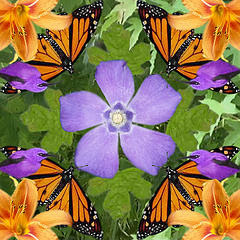
The complementary color scheme is used above in this picture of the butterflies and the flowers

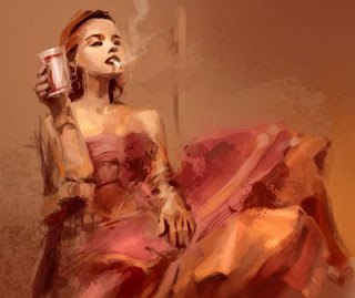
An analogous color scheme is seen above using reds, red-oranges, and oranges

This piece of blue wonderful-ness uses a monochromatic color scheme!

Split-complementary was used in this photograph, in a way: Orange and blue-violet/blue-green, or the other way around: Blue and yellow-orange/red-orange


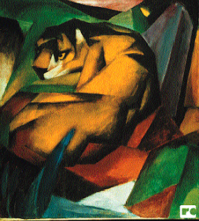
Split-complementary: This piece uses yellows, reds, and blues to create a slightly geometric look, as they do not simply "blend together".

Andy Warhol!

Within what art genre did Warhol work?
Pop art!

Define the genre?
An art movement that emerged in Britain in the 1950s, generally using mass-produced visual commodities by removing the object from context for contemplation

During what years was he alive?
August 6, 1928- February 22, 1987

Post 2 samples of his art. Answer the following questions for each piece.

Title of the piece?
Campbell's Tomato Soup can by Andy Warhol

Describe the color that he utilizes. Does he use any particular color scheme?
Red; and he just used red and white in this one

What do you notice about the artwork itself?
It looks like the label of the soup can, 2-dimensional; it seems realistic and very detailed; color-blocking is used


Title of the piece?
Marilyn Monroe

Describe the color that he utilizes. Does he use any particular color scheme?
Blue, yellow, and pink (red); this is a triadic color scheme

What do you notice about the artwork itself?
For the most part, it's rather color-blocked, and very realistic with the black shadows

Friday, October 14, 2011

Review Week 9!

Compare and contrast vector graphics and pixel images.
Vector-based graphics are defined by mathematical equations and are scalable to any size, meaning that they can be stretched or shrunken and still maintain all quality. They are constructed by lines, shapes, and curves (include icons, illustrations, t-shirt art, etc.). Pixel-based images, on the other hand, are constructed of pixels, and produce continuous tone images (unlimited ranch of colors and shades of grey). They are resolution dependent.

What resolution is necessary to print raster images?
To render a raster image accurately, a high end printer needs a resolution of 300 dpi (dots/inch)

What resolution is necessary to display raster images on the internet?
On-screen, raster images typically need a maximum of 72 dpi (a lot smaller, eh?)

Happy Friday! :) Half-way through October already?!

Friday, October 7, 2011

Steve Jobs

Who is Steve Jobs?
An American computer entrepreneur and innovator and co-founder of Apple Inc. He was also a prominent past figure in Pixar Animation Studios and Walt Disney Studios.

What company was he CEO for many years?
Apple!

What did he do for the computer industry?
Jobs came up with, and helped engineer/build, the Macintosh computer, a successfully small computer with graphical user interface. He also founded NeXT Computer, which was very technologically advanced, and later included a vast multimedia email system.

How did this man impact the graphic design industry?
Steve Jobs was very into making his designs aesthetically pleasing, and he created innovative computers that allowed for the progress of the graphic design industry.

:)

Review Week 8!

Why must designers pay close attention to how color is utilized within a composition?
Color choice makes or breaks a design; when used correctly, color can convey the message that the designer is trying to, and can also evoke an emotional reaction.

Why is the color wheel an important tool for graphic designers?
This visual tool shows the relationship between primary, secondary, and tertiary colors, as well as their complementary and analogous colors.


Find an example of neutral colors utilized within a design (hint: google poster design). Near the sample, discuss why you feel the designer included neutral colors within the composition.

The neutral colors in this Kings of Leon poster gives it a very aged, vintage feel, much like their music (at least in my opinion). It's soothing to the eye in a similar fashion to how their music is soothing to the ear! :)

Briefly describe how we "see" the color of an object?
When light hits an object, all of the colors are not absorbed in the object and are instead reflected off of the object are the colors of the object. And that, my dear viewer, is how one "sees" the color of an object.

Farewell for now!

Friday, September 30, 2011

Podcast #2: Color Theory!

The right use of color can do what?
Can maximize productivity, minimize visual fatigue, and relax the body

Within the electromagnetic spectrum, which waves allow us to see color?
Visible light!

Describe white light?
Equal parts of all colors in the visible light spectrum

How do we see color if objects "have no color of their own"?
Light hitting an object, and the color that is reflected off the object (and not absorbed into the object) is the color we see

What is a glass prism?
A transparent,triangular object that breaks white light into all the colors of the visible light spectrum

What seven colors result when white light is refracted through a prism?
Red, orange, yellow, green, blue, (indigo), and violet

Describe hue?
Refers to the color itself; each different hue is a different reflected wavelength

When does white light occur?
Occurs when all wavelengths are reflected back to the eye

When does black light occur?
Occurs when no light is reflected back into the eye

How color is perceived depends on what?
Depends of the type of light it is seen with (like daylight or night, incandescent, fluorescent)

What is a color wheel?
A visual tool that shows the relationship between primary, secondary, and tertiary colors (and complementary, analogous, schemes)

What are primary colors? Name them?
Colors that cannot be created by mixing any other colors; red, yellow, and blue!

What are secondary colors? Name them?
Created by mixing two primary colors; orange, green, and violet!

What are tertiary colors? Name them?
Created by mixing a primary and secondary color together; red-orange, yellow-orange, yellow-green, blue-green, blue-violet, and red-violet

What are neutral colors? How can they be created?
Colors that do not show up on the color wheel; colors of very low saturation (intensity)

How can a neutral color help a design?
Help put the focus on other colors or serve to tone down overpowering colors

What are complementary colors? Name them?
Colors positioned opposite of each other on the color wheel; red and green, orange and blue, yellow and violet

What is color value?
Refers to the lightness or darkness of a hue

What is a shade?
Created by adding black to a hue, producing a low-value color

What is a tint?
Created by adding white to a hue, producing a high-value color

What is saturation/intensity?
The brightness of a color; at full intensity when not mixed with black or white

What happens when you mix complementary colors together?
Creates a dull tone; though when put side-by-side, intensity is increased

Describe color harmony?
A pleasing to the eye, engages the viewer, and creates a sense of order

What is a color scheme?
Harmonious color combinations; used to create style and appeal, and based on the color wheel and arrangement of colors; color schemes remain harmonious regardless of the rotation angle

Describe a monochromatic color scheme?
Uses variations of tints or shades (values) of one color; clean and elegant, soothing effect and easy on the eyes

Describe an analogous color scheme?
Uses three adjacent colors on the color wheel; one color as a dominant color, while the others are used to enrich the scheme; usually found in nature and pleasing to the eye; bright and cheery effect, though can accommodate changing moods

Describe a complementary color scheme?
Uses two colors opposite to one another; draws a lot of attention; works best in situations where you need high-contrast compositions; found in nature all the time!

Describe a split-complementary color scheme?
Uses three colors: one color and the two colors adjacent to its complement. This draws attention without the tension of a complementary scheme

Describe a triadic color scheme?
Uses three colors equally spaced among the color wheel and offers a strong visual balance

What colors are considered to be warm colors?
Vivid in nature; yellows, oranges or reds (aggression, excitement, and danger)

Describe a warm color scheme?
(Can represent aggression, excitement, and danger, as well as being strong and welcoming, but will overpower other colors in a design.) They are bold and energetic, and tend to appear closer to the viewer

What colors are considered to be cool colors?
Soothing in nature; greens, blues, and violets; passiveness, comforting, and nurturing

Describe a cool color scheme?
Calm and rarely overpowering; appears further away and is used to give the illusion of depth

Why is important to consider which colors are being used within a design?
The right color choice can convey the right message and evoke the desired response to any form of visual communication; it creates and emotional reaction

Happy October! :)