Wednesday, May 9, 2012

Assignment 20: Research and Inspiration!

Social Issue Logo and Poster!

---
Research:
Shepard Fairey- Born February 15, 1970 in Charleston, South Carolina as Frank Shepard Fairey. He attended the Rhode Island School of Design with a bachelor of fine arts in Illustration. He is, according to Wikipedia, "an American contemporary graphic designer, and illustrator who emerged from the skateboarding scene". His work includes Obey Giant, the Obama Hope poster, and Andre the Giant has a Posse. 
Examples:


Chosen social issue: America's Obesity

Logo- Tape measure
Portrait-Feet on a scale


Visual Hierarchy-
1. Portrait
2. text
3. logo


Color trends regarding obesity- yellow, red, B&W. I'm thinking McDonalds or fast food. The yellow for the tape measure, red for warning (like below), and B&W are dramatic 


Inspiration:


I like the way the photos contrast the text with a bright red sans serif font. 

This one is just a nice way to get the point across :-)

Thursday, April 26, 2012

Assignment 19: Research and Inspiration!

Stationary package: Printed pieces that a company uses for communication purposes, like a letterhead, envelope, and business card


Research:
Color trends- From Benjamin Moore Paint 


F

The earthy tones of these colors would work well for a salon (Azul Salon and Spa), or some sort of business that needs to evoke a calm feeling


These bright colors would look great with The Candy Shop, the colors being bright and solid. They really show a good sense of exuberance
For Ted's Hot Wings, the bottom left block would look great. 


These colors are literally perfect for a candy shop, and the azalea or nasturtium colors would look very unique in a salon design

Visual Hierarchy
1. Logo
2. Name and title
3. Information


Inspiration: Business Card

I like the color and layout of this. The actual card to the top left has some personality with a rounded side, but would still fit the required size for business cards. The colors are nice and simple, and the logo is also simple but shows great consistency within itself

I love the simplicity of this one and how the font of "katie's" makes it seem more youthful and casual, while the clean design keeps it modern. The logo is nice and simple, though it is three pantone spot colors. I really like the color combination!


This business card is so youthful and cute, and uses repetition in a non-annoying way, which is nice. I like the vertical layout and how well everything still fits. I don't think there is a logo on this one, but it's cute!


Wish me luck!!


------


Inspiration: Letterhead


Colors-Same as the logo/business card:
Pantone 5275 U and 5255 U


I love the design of this! The colored squares are just so nice, and the letterhead is super simple and blocky, but matches everything else really well. I also like how the information is at the BOTTOM of the page rather than in a column at the top


This is very nice! I loooove the letterhead, period. That is all 


This watermark is nice! I like how the letterhead is super simple, and but is the same logo as the other  things. And there's a THEME going on with all these watermarks! That's fancy~


----
Inspiration: Envelope
Color almost to the edge, but not quite...!


So simple but pretty! I like the Use of the two colors differently between the business card and the envelope :)

I like how the address is underneath the logo! It's nice and simple!

Tuesday, April 24, 2012

Stationary Package!

Stationary Package: the printed pieces that a company utilizes for communication purposes (letterhead, envelope, business cards, etc...)


*When establishing a business, it is important that all communications are well coordinated and that the message of the organization is presented consistently


Basic stationary package includes:

  • Business card
  • Letterhead and
  • Envelope
---
Business Card- When you hand someone your business card, they will form an immediate opinion about your company. It says something about your company--its mission, culture, and goals. 
-Everything from the COLORS, FONTS, the TEXTURE, SHADE, and GLOSS OF THE PAPER you print on says something about you.
Includes...
-logo #1
-company name #1
-employee name #2
-title #3
-phone number ITALICIZED
-fax number ITALICIZED
-email address BOLD
-company address 
-web address BOLD

*Visual hierarchy is very important!!

Design tips:
+Must be 2" x 3.5" (fits in a wallet size)
+Margins about 1/4" (0.25) or 1/8" (0.125)
+Horizontal OR vertical orientation
+Check for accuracy
+Check for unity...continuity among other pieces

---
Letterhead- A printed piece of paper used to send letters, memos, etc.
-Generic to the company
-Make sure there is plenty of blank space for actual text! 2/3 to 3/4 of it~ (A watermark is okay to include in a large size)


Typically includes...
-logo BIG AND PROMINENT!
-company name
-company address
-phone number
-fax number
-web address


Design tips:
+In the United States, it must be 8.5 x 11
+Must be vertical/portrait orientation
+Must leave room to write the letter, memo, etc. Big empty space in the middle!
+Check for accuracy
+Check for unity...continuity among other pieces


---
Envelope- The packaging that contains the letter/form when being mailed
-Standard #10 envelope 
-Expensive to print all the way to the edges of an envelope


Typically includes...
-logo
-company name
-company address


Design Tips:
+Must be 9.5" x 4.125"
+Horizontal or vertical orientation
+Must leave room for recipient's address and stamp
+Check for accuracy
+Check for unity...continuity among other pieces

---

Thursday, April 19, 2012

Assignment 18: Research and Inspiration!

RESEARCH:

Wordmark- a logo that consists of just the company's name rather than the name and design. The design is IN the words.

In Focus Photography
St. Henri Hotel
Mimi's Flower Shoppe


---
INSPIRATION:
In Focus Photography
-Bokeh
-Broad and long lines
-blur the edges?
-Simple

-Visual Hierarchy-
1. Focus
2. In...Photography

Use some sort of layering bokeh on the O in Focus? Opacity..

Focus on one part, so it gives an effect of focusing a camera. Maybe the edges will be blurred?

Mimi's Flower Shoppe
-Swirly and girly or
-Soft and serious, maybe a cursive font
- Simple flower dots above the i's?

-Visual Hierarchy...
1. Mimi's
2. Flower Shoppe

I love this work mark. It is almost abstract, but I personally could still make out Villa Moda. It's cute and a good use of typography

Little roses to dot the i's!!! :-)

Or something like this so that it takes up a whole dot :-)

Friday, April 13, 2012

Assignment 17: Research and Inspiration!

Research:
Combination mark (AKA Combimark!)- a graphic that includes both text (the company name) and a symbol/graphic.

Well, I hit the jackpot with the Pantone 2012 spring color forecast. The color Margarita (14-0116) looks fantastic for green, but maybe just a darker shade would be good.

So let's keep it simple; this is still a logo, right? But let us also use the Pantone spot colors, so really...it needs to be simple.

I'm going to start with...
-Three Tree Landscape!

I'm thinking it would be good to include not just grass, which I'm seeing a lot of, and not JUST trees, which I'm also seeing some of, but find a way to make it all come together in landscaping in general. Maybe some pebbles, flowing water, and trees?

Visual hierarchy:
1. The company name
2. Pebbles/water
3. Three trees~

Colors?
-margarita-ish
-a grey-blue that could do both water and pebbles? Or...
-a simple green for the trees, and...I have no idea.

Inspiration:
The incorporation of an actual landscape is nice advertising, and it leads the eye from the graphic down and back up to the company name, or even the other way around.


Aw, well...there are three trees, but I'm not looking at that! I'm looking at the use of color and texture on the trees, while it is still simple enough and put together to have a glance and go.

This is one of the cutest combimarks in the world. It has a theme that's fun and young, but is also simple and easy to understand while appealing to a new generation of home owners.

I absolutely love the simple look to the design. It shows water, grass, and mountains (with, of course, the sun!) and the papyrus font even helps keep it clean!

Wednesday, April 11, 2012

Logotypes!

Logotype (LOGO)- A graphic mark or emblem commonly used by commercial enterprises, organizations, and even individuals to aid and promote instant public recognition

  • Numerous inventions and techniques have contributed to the contemporary logo...
including logographic languages, such as:
-Egyptian Hieroglyphics
-Coats of Arms
-Water marks
-The development of the printing technology

  • During the Industrial Revolution of the 18th and 19th centuries...
-Photography and
-Lithography (an early method of printing)
contributed to the boom of an advertising industry that integrated typography and imagery together on the page...

...At the same time, typography was also undergoing a revolution of form and expression past plain (modest) serif typefaces used in books...

...The arts were expanding in purpose:
-Expression and decoration of an artistic storytelling nature
-To a differentiation of brands and products that the growing middle classes were consuming!

  • By 1890, the US had 700 lithographic printing firms employing more than 8,000 people! (more consultancies and trades-groups in the commercial arts)

-Children's books
-Authoritative newspapers and
-Conversational periodicals
developed their own visual and editorial styles for unique, expanding audiences

  • As printing costs decreased, literacy rates increased, and visual styles changed, the Victorian decorative arts lead to an expansion of typographic styles and methods of representing businesses

  • 1950s:
Modernism- An avant-garde artistic movement in Europe, becoming an international, commercialized movement in the US and elsewhere
-Visual simplicity and
-Conceptual clarity
forming a powerful toolset for a new generation of graphic designers

LESS IS MORE!

Modernist-inspired logos proved successful in the era of mass visual communication ushered in by TV, improvements in printing technology, and digital innovations

  • Logo design is an important area of graphic design, and a difficult one to perfect!
-But this is simply because logos are meant to represent companies' brands or corporate identities and foster their immediate customer recognition

Still, LESS IS MORE!
because...
Real people in real life situations do not stare at and analyze logos, they just see it; at a quick glance must be able to quickly get the company recognized...no detailed and complex logos!

A logo needs to be simple, but have enough personality that is stands out in a crowd

LESS IS MORE!

-----
5 Principles of Effective Logo Design
-Simple: easily recognizable, but unique while not being overdrawn
-Memorable: keeping it simple yet appropriate makes it easy to remember
-Timeless: will it still be effective in 10, 20, 30 years? Trendy is good, but will it last?
-Versatile: work across a variety of media and applications, so they should be designed in vector format to ensure that they scale to any size
Still effective in...one color, B/W, reverse color, the size of a postage stamp, or the size of a billboard?
-Appropriate: how to position the logo should be appropriate for its intended audience; for example, a child-like font and the color scheme would be appropriate for a children's toy store, but not for a law firm

------
Four Color Process vs Spot Color
-Four Color Process (full color printing): technique used for printing with full color. The four colors of the spectrum when mixed in proper proportion.

C M Y K

-Spot Color: a method of specifying and printing colors in which each color is printed with its own ink. It is (cost) effective when the printed matter contains only ONE to THREE different colors, but it comes prohibitively expensive for more colors.

Pantone Matching System (PMS)- A color swatch that shows the color with its identification code in order to choose the colors to be printed

-Why to choose color wisely? Bright, eye-catching, maybe some sort of significance

**Color plays an important role in logo design. It can illicit different feelings and emotions from the audience

-Interpretation of color may vary depending on age, gender, and cultural demographics. The color selection should be based on the target audience!

-Colors tend to follow trends, so a new vibrant company may want to follow current trends, whereas a bank may choose to stay with a more conservative color palette...JUST BE CAREFUL--trends change.

**Keep the color palette two or three--too many colors will increase your cost of production and may cause a chaotic design

------
Combination mark- graphics with both text (usually the company name) and and a symbol or graphic together! LIKE A FAMILY! Choose colors that will work together! LIKE HABITAT FOR HUMANITY VOLUNTEERS!

------
Iconic/Symbolic- symbols that are uncomplicated and sometimes abstract. They are less direct than straight text, leaving more room for interpretation; they can stand alone, still.
When designing these...
-Instantaneously recognizable
-Memorable
-Clarity when reproduced

Wordmark/Lettermark- just the company name, making it interesting using typography and stuff. Like CNN, Fedex, Disney, Mossimo, etc. Utilize contrast in these so that words look help portray the company's feel. Focus must be the word itself!!

Monday, March 19, 2012

Assignment 16: Research and Inspiration!

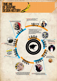
History Timeline (Infographic):

Research on Information Graphics:
  • Visual representation of information, neat and organized, presenting complex information quickly and clearly
  • Visual shorthand
  • Charts, diagrams, graphs, tables, maps, lists, and timelines
  • Often used for maps, statistics, weather forecasts, etc.

Inspiration:
Color scheme- earthy tones, neutrals, skins, greens, browns, cremes
Visual ideas- sign language, loopy thread, a little grungy (or very, very clean), fake graph/table
Information- At least one of each podcast (~9 to 10)

Sign language hands: trace each letter needed and use opacity and brushes to color in

I find the dark contrasting with the light very appealing. Dark side could have date, light side the fact

Good color scheme. the use of photos in little bubbles works well with the simplicity of the overall design, and the use of large and small text (year vs description)

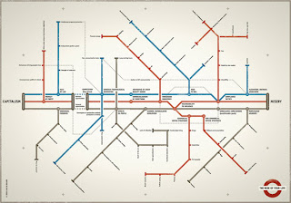
The use of a transit map is so extremely witty it's not even funny. I like how the center three line includes the descriptive facts, and the smaller routes branch off into some other text, related to the fact, most likely.


Wish me luck!

Monday, March 5, 2012

Assignment 15: Research and Inspiration!

Illuminated Manuscript!

Research-
Illumination- the paper background and border design, colors, theme
Initial Cap- huge first letter of the text, theme with design, same colors
Text- a song, poem, story, etc.

Used for religious text, very ornamental, hard to make

Inspiration-
-Water themed: fish, ocean waves, scales
-Color scheme: Monochromatic-- blue blue blue blue blue! And gold.
This has a really simple illumination that I like, and the initial cap has a beautiful color and water texture

I absolutely love this illumination. It has a gorgeous design and the leaf and vines work well with a simple smaller background. And I really like how each line of text is separated and has smaller initial caps and fonts/designs within. It is simple and neat, but still appealing and easy to read

I like the scales and different colors within, as well as the design being contained in a shape (the 'O'). The colors are also nice and simple...soothing, almost.

And last...
This layout is beautiful. I love how intricate it is, and how it does not surround the whole body of text, but instead has bracket-type look to it. And the added illustration on the right is nice, and keeps things simple. I also like how the initial caps really blend in with the illumination.


Wish me luck...!

Thursday, February 23, 2012

Early Computers | 1930s-1980s AD

What is an abacus?
Performed simple math calculations

In 1936, Zuse invented this type of computer?
The first freely programmable computer

Post a photo of the 1944 Mark Computer.
In 1944, Aiken and Hopper designed the Mark Series of computers to be used for what?
Used by the US Navy for gunnery and ballistic calculations

Post a photo of the UNIVAC Computer.
In 1951, Eckert and Mauchly designed the first commercial computer for whom?
For the Census bureau

What does UNIVAC stand for?
Universal Automatic Computer

In 1953, IBM enters the scene. What does IBM stand for?
International Business Machines

What is FORTRAN?
The first successful high level programming language...The IBM mathematical formula translating system

Post a photo of the first mouse.
In 1964, how did Engelbart change the way computers worked?
He made computers more user-friendly by inventing the computer mouse

What is the significance of ARPnet?
The first internet. It was developed to protect the flow of information between military installations by creating a network of geographically separated computers

In 1971, Intel introduced this? Post a photo of it.
The first single chip microprocessor, the Intel 4004:

In the same year, IBM introduced this? Post a photo of one.
The first "memory disk", commonly called the "floppy disk" because of its flexibilty:

In 1973, Metcalf and Xerox created this?
The first ethernet computer network

During the next several years, the first consumer computers were marketed. Post photos of the Altair, Apple I, Apple II, TRS-80, Commodore PET. Label each.
Altair^

Apple I^

Apple II^

TRS-80^

Commodore PET^


In 1981, Bill Gates and Microsoft introduced this package?
The MS-DOS computer operating system which was packages with the IBM PC

Post a photo of the Lisa computer.
In 1983, who introduced the Lisa computer?
Apple!

What is GUI?
Graphical User Interface

Post a photo of the computer mentioned below.
In 1984, a more affordable home computer was introduced. Name the computer and the company that marketed it?
The Apple Macintosh computer

The commercial only ran one time. When?
January 22, 1984 on the Super Bowl

In response to the Apple GUI, Gates and Microsoft introduced this?
The Windows operating system

Two men are known for their development of the Apple I computer. Who are they?
Steve Jobs and a poor man I do not know the name of.

When was the internet that we know, world wide web, developed and introduced?
No idea. Doesn't say.. :-(

Over the years, Apple has included "easter eggs" within their software. What is an "easter egg"?
Little tricks and witty or cute things that Apple has included in some of their software?

Search for easter eggs in Photoshop and Illustrator. List a few in this post ... and try to find them in the applications.
I'm not sure what I'm looking for.

Where do you think computers will take us in the next 10 years?
To the moon! Oh, wait...